Worldcup Analysis with Metatron Discovery
Notice: Undefined offset: 1 in /data/httpd/www/html/wp-includes/media.php on line 764
Notice: Undefined offset: 1 in /data/httpd/www/html/wp-includes/media.php on line 766
Notice: Undefined offset: 1 in /data/httpd/www/html/wp-includes/media.php on line 769
Notice: Undefined offset: 1 in /data/httpd/www/html/wp-includes/media.php on line 70
Let’s make a dashboard for analysis using the World Cup match results data.
This document will show you how Metatron Discovery ‘s Data Prep function and workbook features can be used in your analysis.
1. Creating datasets for Worldcup
First, let’s get the data with World Cup matches result information. You can download data for the World Cup matches result in Excel format from Tableau’s Public Data site.
Now let’s process the downloaded data using Data Prep.
All accounts of metatron Discovery will be admin in this example. But, only users with Data Administrator privileges can use Data Prep in real-world.
Log in as admin and go to “Management-> Data Preparation-> Dataset”.
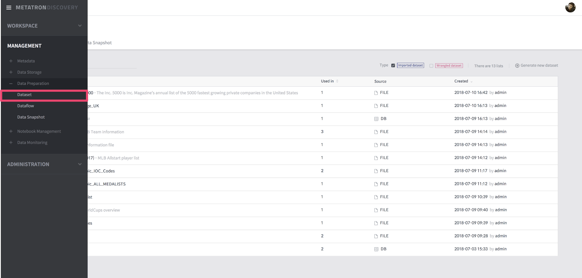
[Figure 1] Move to Dataset
Now select the Generate “new dataset” button to create the new dataset. At this time, if a dialog box such as “Select a data type” appears, you have to select the data type. Select “File” because the imported data is an Excel file.
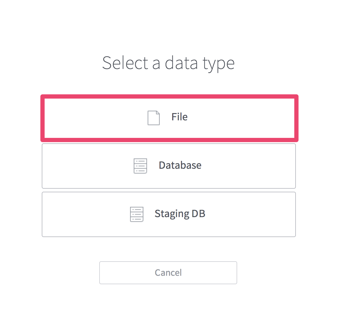
[Figure 2] Select a data type
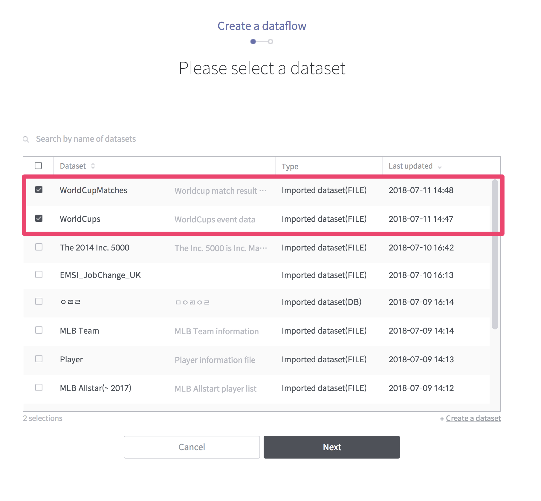
If you upload the downloaded file, you can select the sheet you want to create dataset. In this example, the sheets to be created with dataset are WorldCupMatches and WorldCups. Currently, metatron discovery can only create one dataset at a time. So to create two datasets with two sheets, you have to go through the same process.
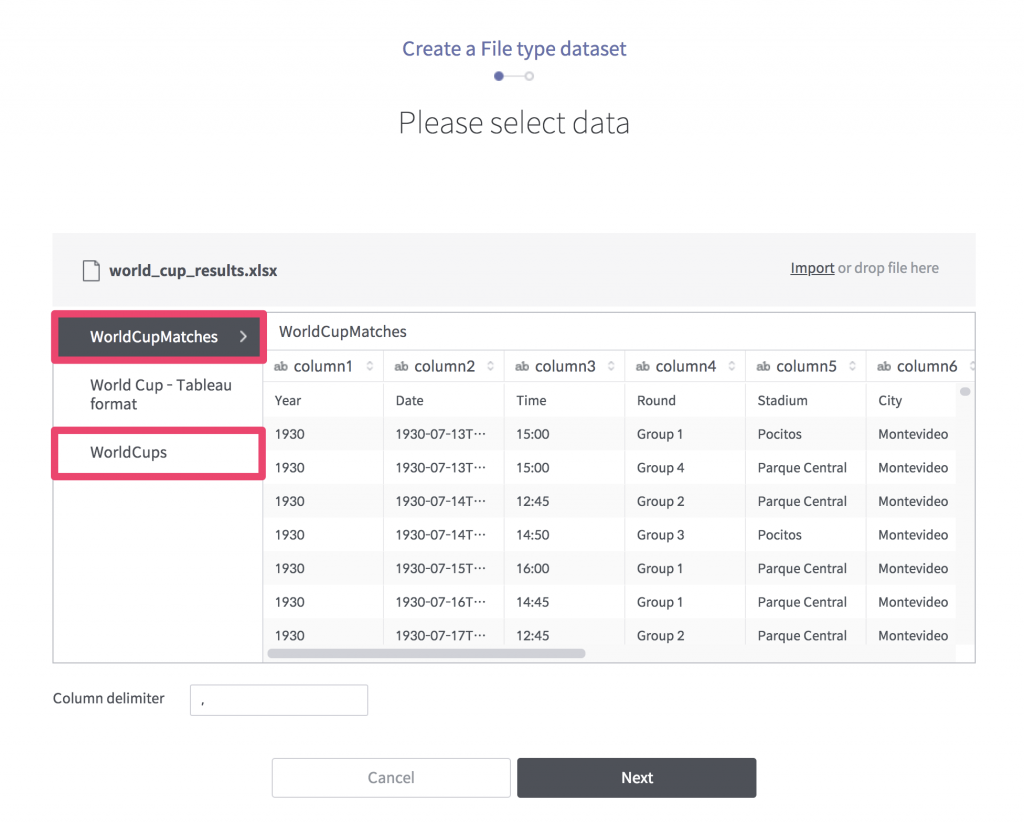
[Figure 3] Select data
Now enter the dataset name for the selected data and finish creating it. Create a dataset for the WorldCups sheet in the same way.
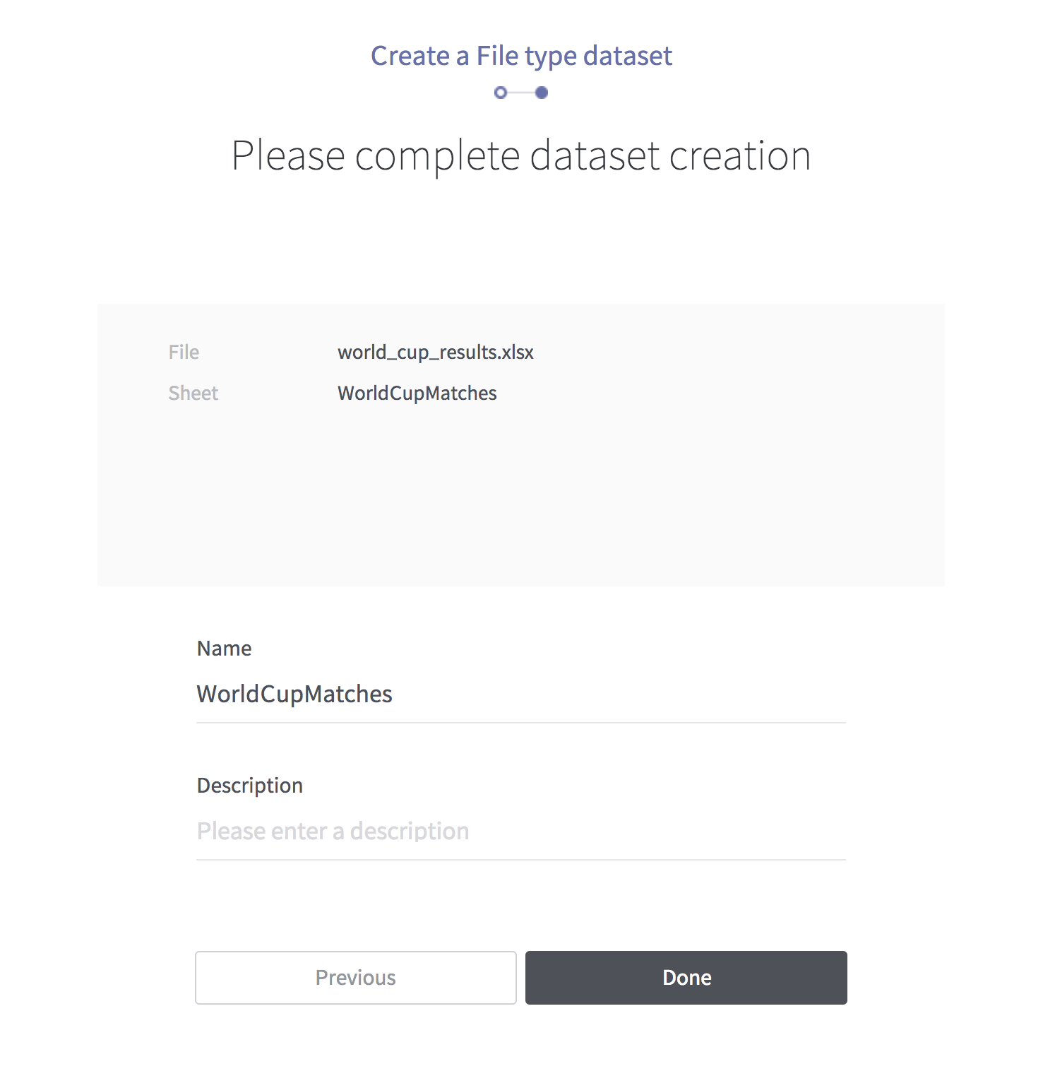
[Figure 4] Create dataset
When all is finished, you can see two datasets in the list:
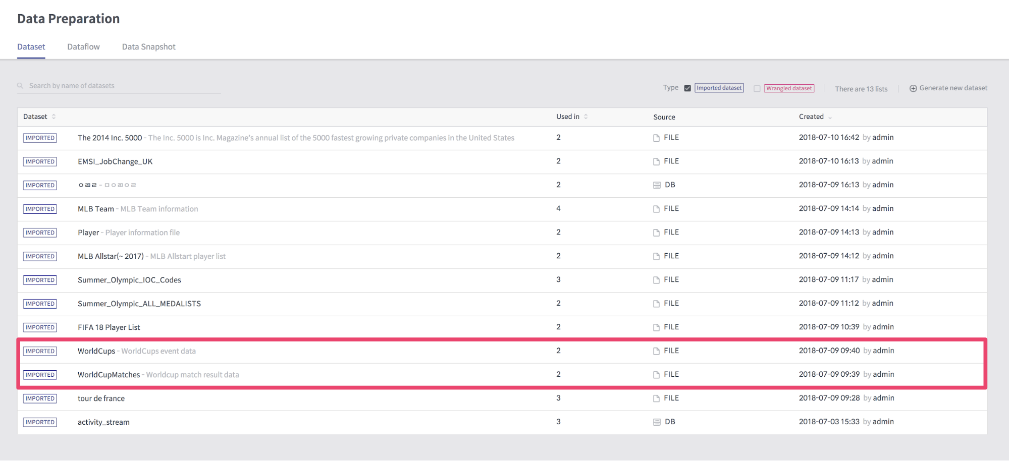
[Figure 5] Dataset list
2. Creating Dataflow
Now create a dataflow using the two datasets we created earlier.
If you select the “Add a dataflow” button on the dataflow list view, you can see the screen to select dataset as follows. Select the dataset you created earlier.
[Figure 6] Select a datasets
After this, enter the name of the dataflow and create it. Then the following dataflow detail view will appear. Select WorldcupMatches and select the “Edit rules” button.
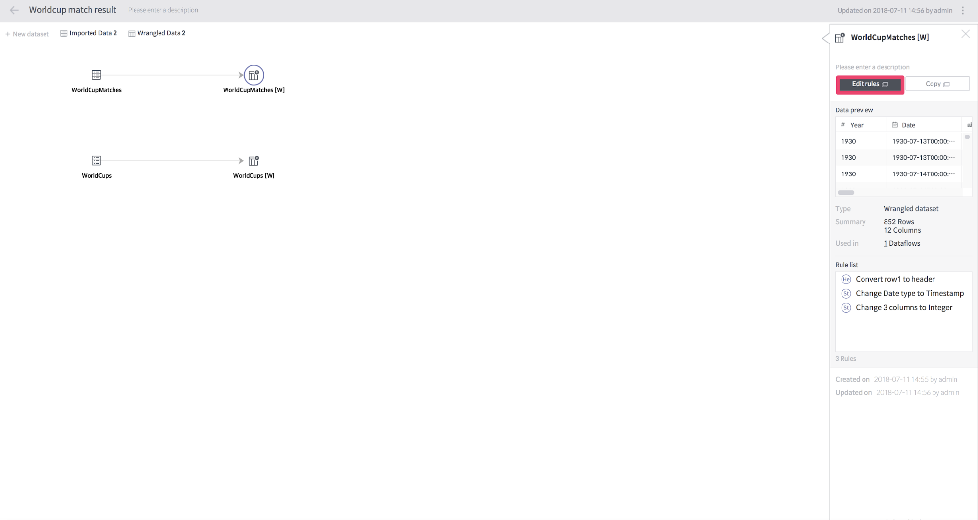
[Figure 7] Dataflow
When you run “Edit rules”, you will see a screen where you can modify the rules applied to the dataset.
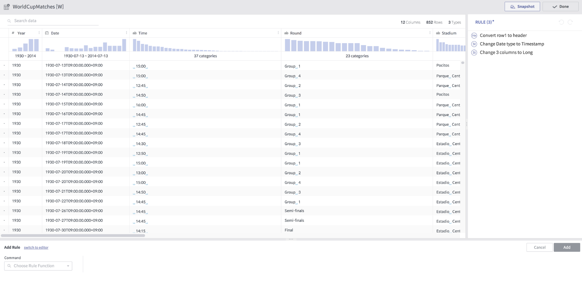
[Figure 8] Edit rules
We will join WorldcupMatches dataset and WorldCups dataset here. If you select join in the command box at the bottom, the compose window for join appears. In the “Dataset to Join” selection box, select WorldCups and join the two datasets using the Year column.
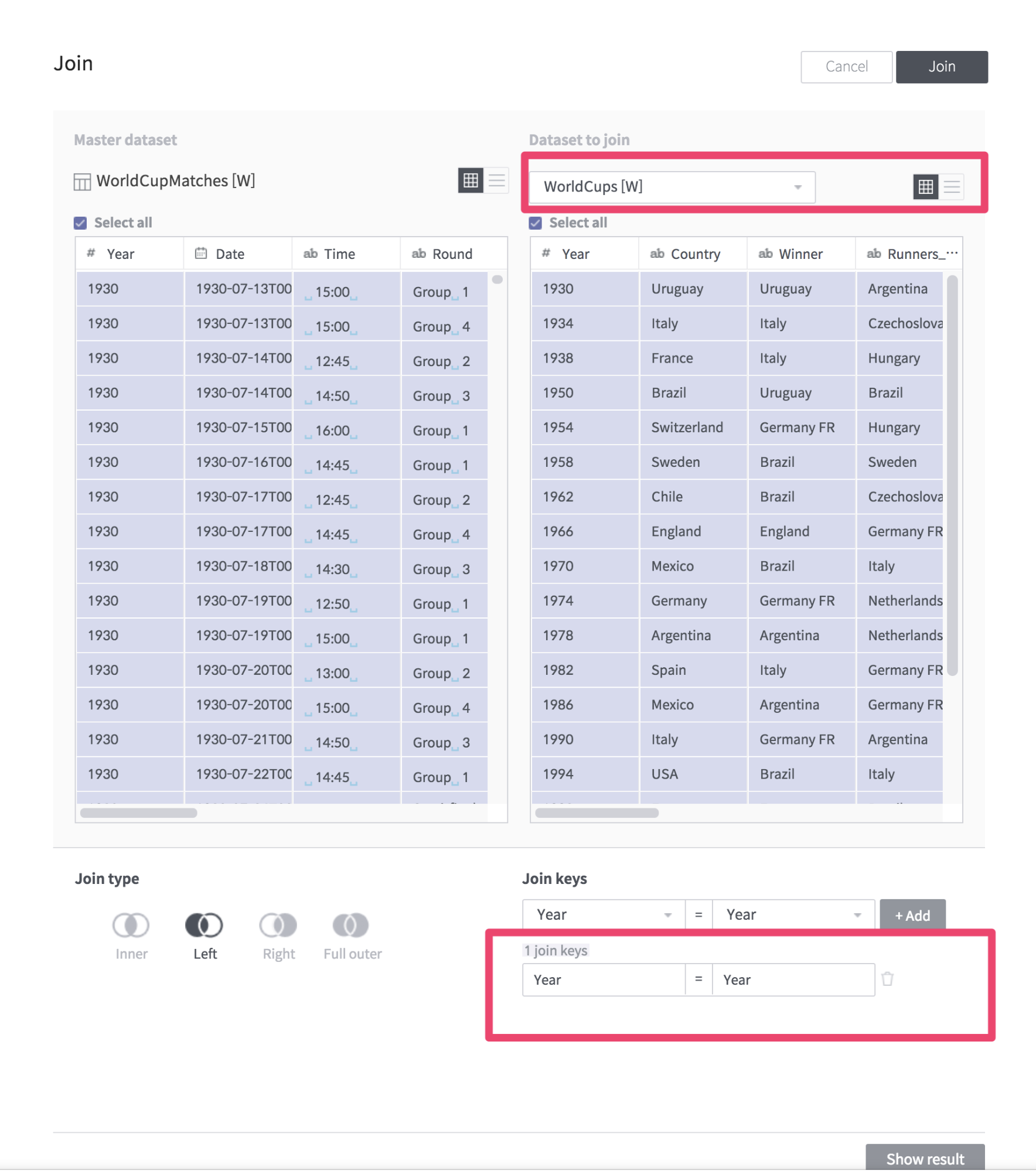
[Figure 9] Join datasets
In addition to this, we execute several rules as follows.
set col: City to trim(City)
Drop col: Observation
settype col: Time type: String format: 'yyyy-MM-dd'
derive value: concat(Date, ' ', trim(Time)) as: OpenningTime
move col: OpenningTime after: Time
drop col: Time
drop col: Date
replace col: Attendance with: '' on: '.' global: true ignoreCase: false
When you have finished creating the Rule, run the “Snapshot” button to create a data snapshot.
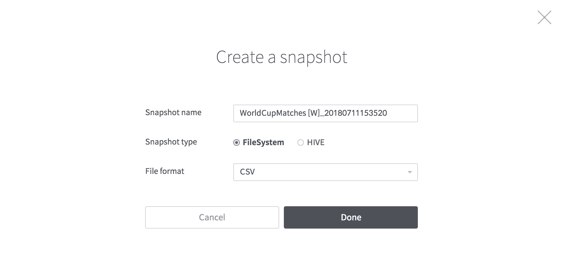
[Figure 10] Create a snapshot
The generated snapshot can be viewed from the “Data snapshot” menu, and the results can be downloaded as a CSV file format. Now we take a snapshot as a CSV file and create a datasource.
3. Creating a Datasource from a Snapshot File
You can create a new Datasource using the downloaded snapshot file.
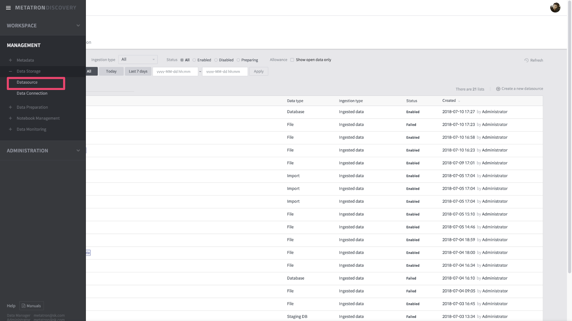
Go to “Management -> Data Storage -> Data source”. Select the “Create a new datasource” button here to create a new data source. A screen similar to the one shown when creating Dataset appears, select File.
[Figure 11] Datasource
The most important part of the data source creation step is setting up the Schema. You need to define the Role of the column. You must specify Dimension and Measure and one Timestamp field according to the attribute definition of Druid. This example defines the field Role as follows:
Measure Field : HomeGoals, AwayGoals, GoalsScored, QualifiedTeams, MatchesPlayed, Attendance
Dimension : Other fields. Specifies the type of OpenningTime as Date / Time.
Timestamp : Current time (Specify the current time because the data size is small)
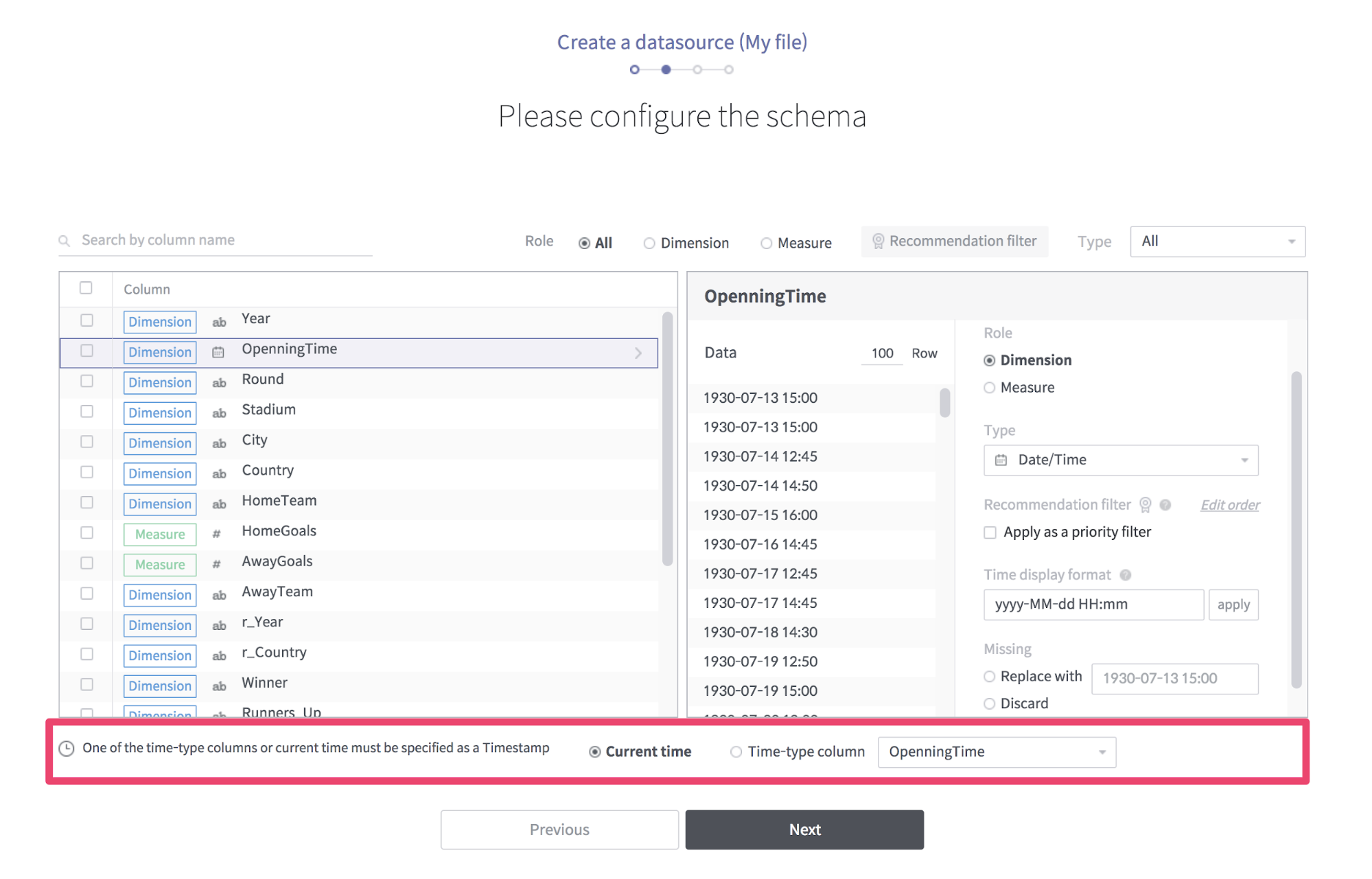
[Figure 12] Configure the schema
The next step is to set the Druid ingestion setting. Specify Segment Granularity as Month, Query Granularity as None, and Rollup as false.
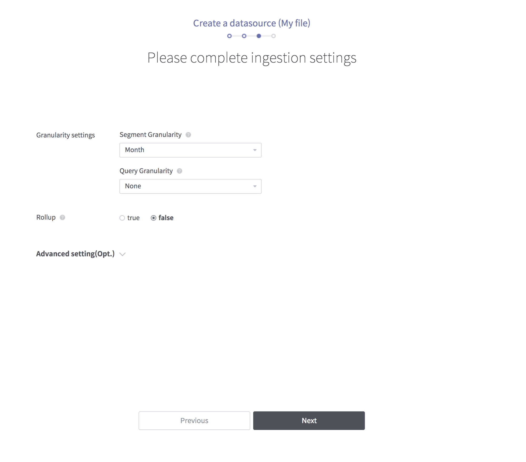
[Figure 13] Druid ingestion setting
Now name the data source and finish the creation.
If the generated data source is enabled, check “Allow all workspaces to use this datasource” in the datasource detail view.
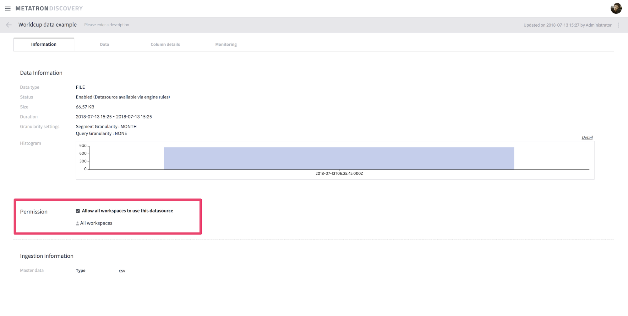
[Figure 14] Check “Allow all workspaces to use this datasource”
The datasource is now ready to use. In the personal workspace, draw a chart using the World Cup datasource.
4. Create a dashboard
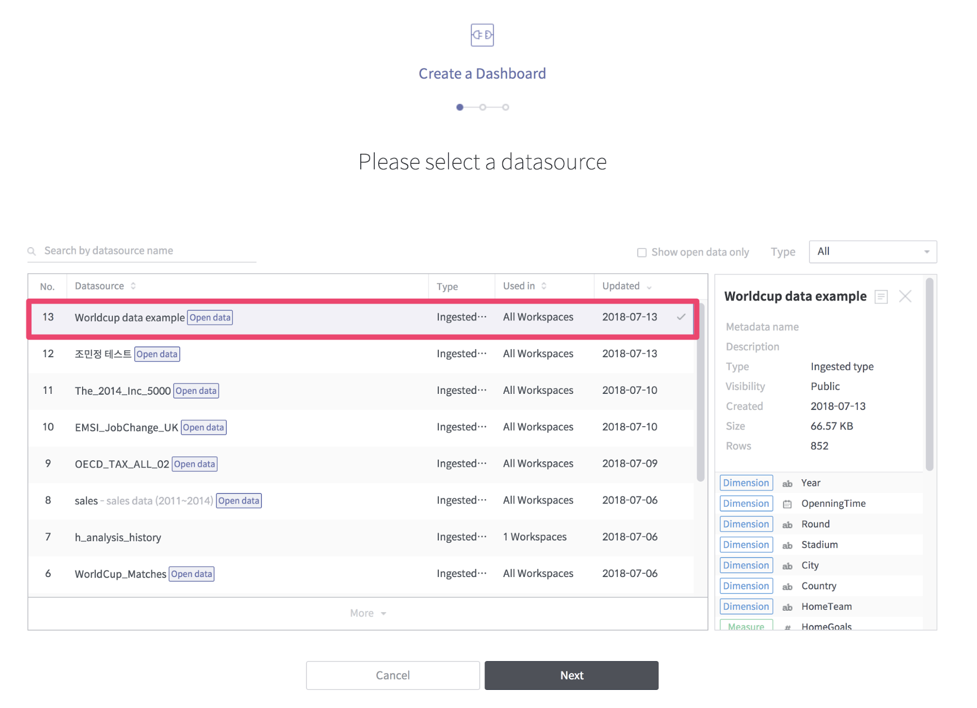
Configure the dashboard with the “Worldcup data example” datasource. When you create a new workbook in your personal workspace, you will see a screen to select a data source. Select the “Worldcup data example” datasource here.
[Figure 15] Select a datasource
Now create a new chart. First, draw the average score of the home team in a chart. Select HomeTeam on the column shelf, and HomeGoals on the cross shelf. The statistics of HomeGoals are average and align is descending. Select color as measure basis and save.
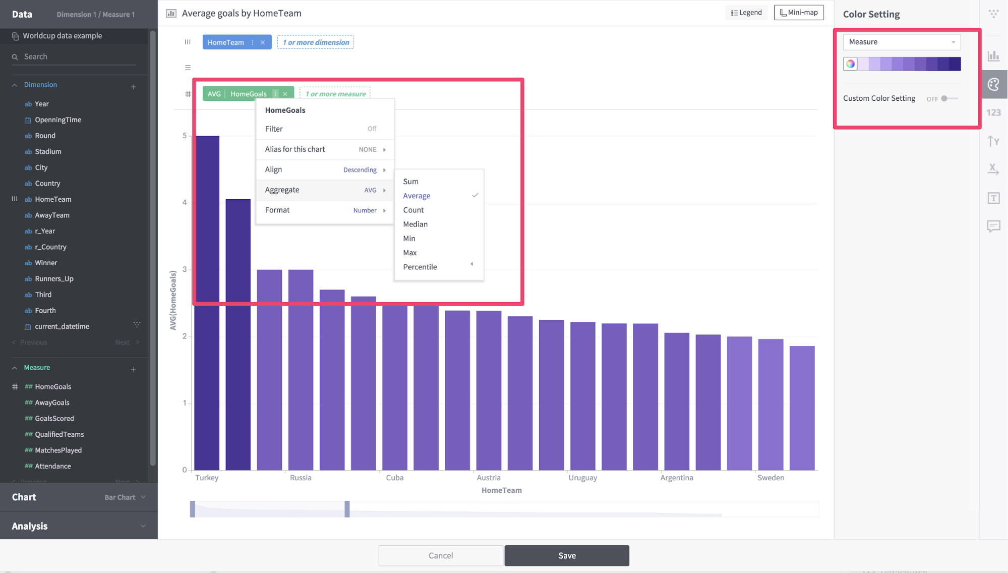
[Figure 16] Drawing chart
Next, we create a table with the average number of goals per round.
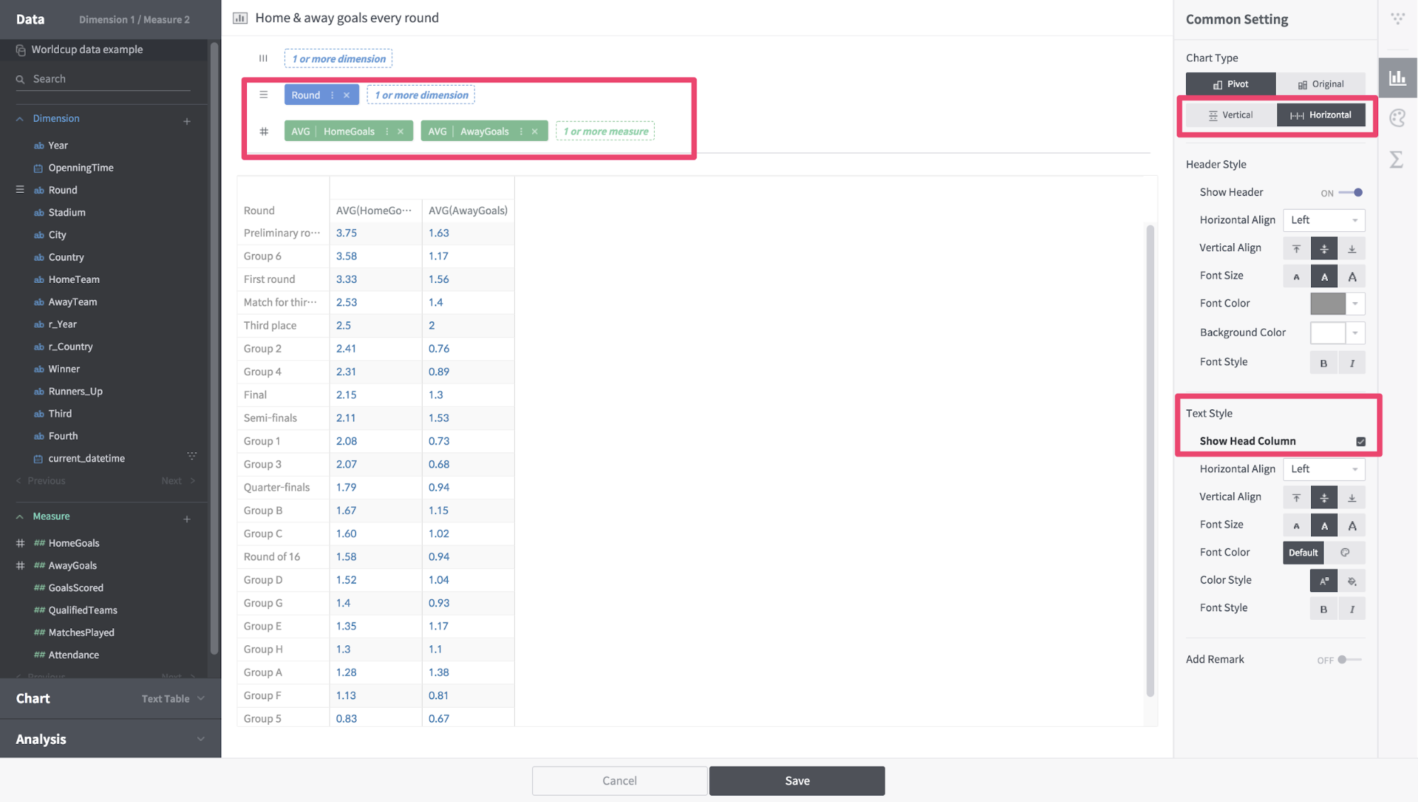
[Figure 17] Drawing chart
Now look at the average number of goals for each World Cup competition. Currently HomeGoals and AwayGoals exist, but you need a new Measure value that combines these two values. To do this, create a custom Measure value.
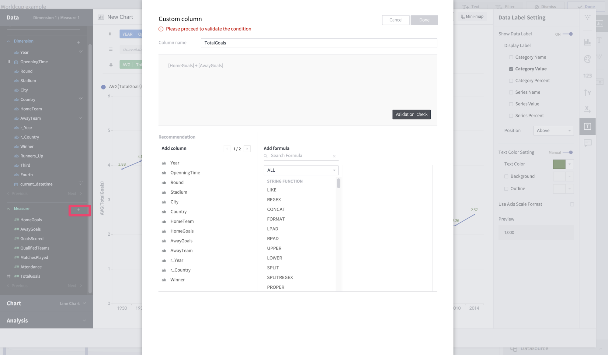
[Figure 18] Create custom measure
Name the column TotalGoals and enter “[HomeGoals] + [AwayGoals]” as the formula. Now put the OpenningTime on the column shelf and TotalGoals on the cross shelf.
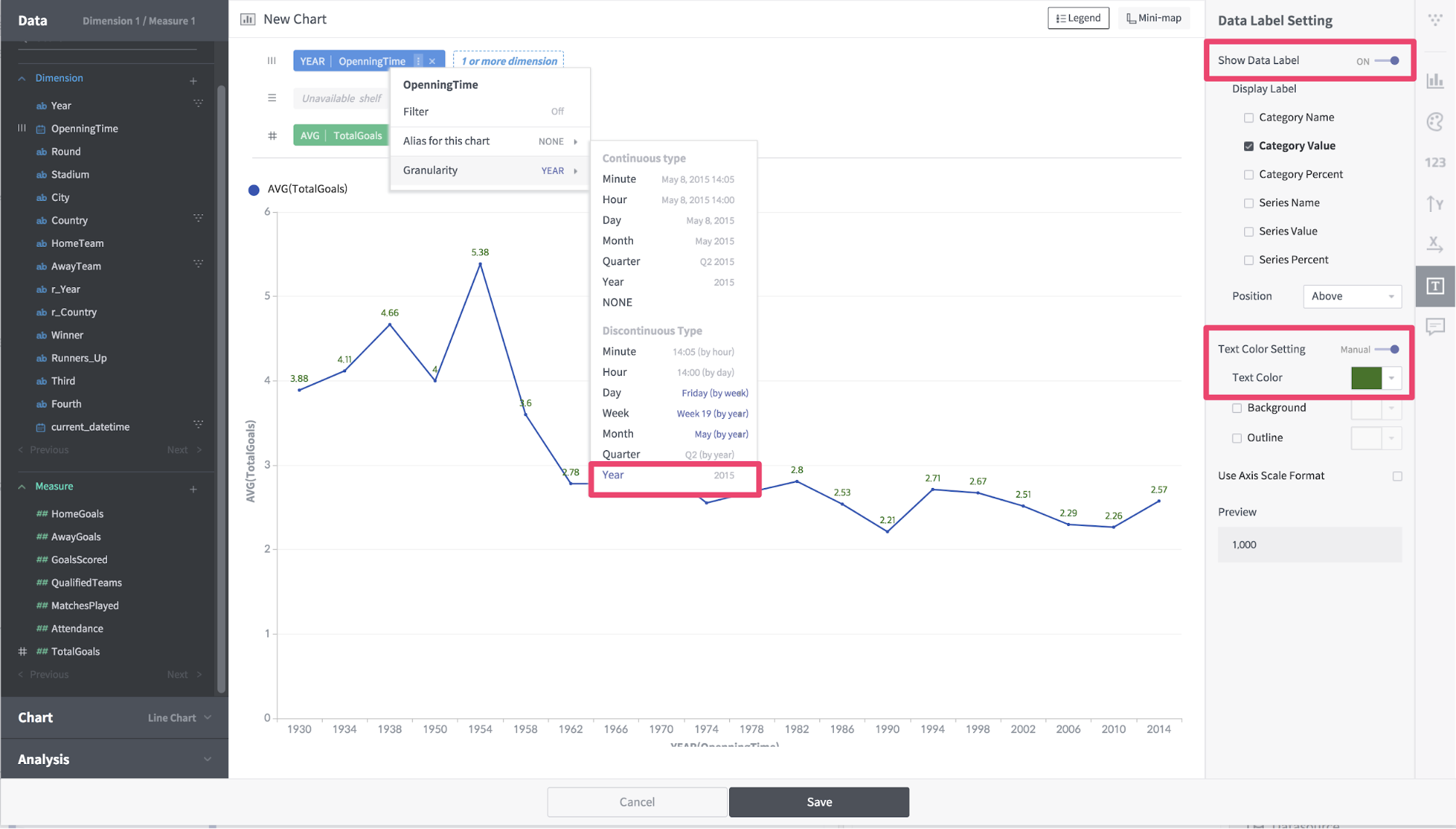
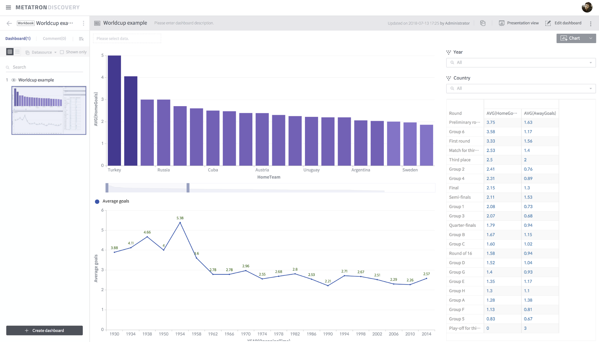
[Figure 19] Average goals by year
Now, on the Edit Dashboard screen, add Year and Country as filters. Adjust the layout and save.
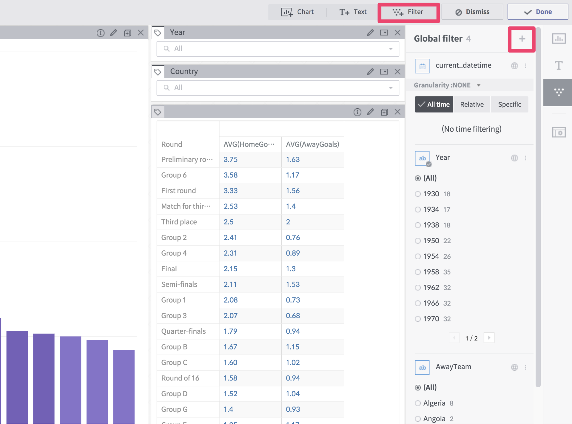
[Figure 18] Add Filter
You can now perform correlation analysis between charts on the dashboard. If you select the desired parts of the chart, you can see that the other charts react together.